

Muji Makeover
Reimagining a Better Online E-commerce Experience.
ROLE:
- UI Designer
- UX Researcher
PROJECT STATUS
Ongoing
TOOLS USED:
Sketch, InVision, Optimal Sort (Card Sorting), Trello, Illustrator
OVERVIEW
This is a conceptual project wherein we were created a redesign for the Muji (US) website. The process began with an intensive research on the company: understanding its brand with respect to the market, looking at user feedback and a heuristic analysis of the website. Afterwards, leveraging the information that was compiled from the research done, I created a mock-up for a responsive web design—focusing on desktop and mobile screens.
RESEARCH
In the course of the research, we used a different research techniques broken down in the following:
CONTEXTUAL INQUIRIES
We first began by conducting contextual inquiries at a Muji store on 5th Avenue, NY. The goal of the contextual inquiry was to see who the users of Muji are, to hear what they like about Muji, and to understand what their experience is with the global brand.
KEY FINDINGS FROM CONTEXTUAL INQUIRIES:
- Muji has a good brand following because of its strong and distinct aesthetic.
- The brand has a lot of loyalists: people come back to buy the same items because they’re tried and tested. People love their stationery
- Shipping costs are a hindrance from online purchases.
- People appreciate the simplistic look of the brand, from the packaging to displays.

Sisters Tanika and Kris eagerly showing off their pen preferences.
USABILITY TESTING
Working with users who were familiar with the brand and have shopped at Muji before; we conducted usability testing on site, with both desktop and mobile browsers, to see how they navigated through the site and to gain insight on their overall experience.
KEY FINDINGS FROM USABILITY TESTING:
- Users had a hard time navigating through the site: whether it was through the Search function because the feature is not comprehensive, or navigating through its categories because the information architecture was very confusing.
- Testers noted that Muji’s brick and mortar stores more effectively represent Muji’s aesthetic and branding than the online store.
PROBLEM STATEMENT:
From our initial usability tests and feedback from Muji store goers, we found a common pattern of concern: we have people who have had a good and engaging experience with the brand’s physical store, but get confused and even frustrated by the contrast of the online experience
“How can we carry over the Muji in-store experience to the online platform to convert store users online and capture new customers?”
Who are we designing for?
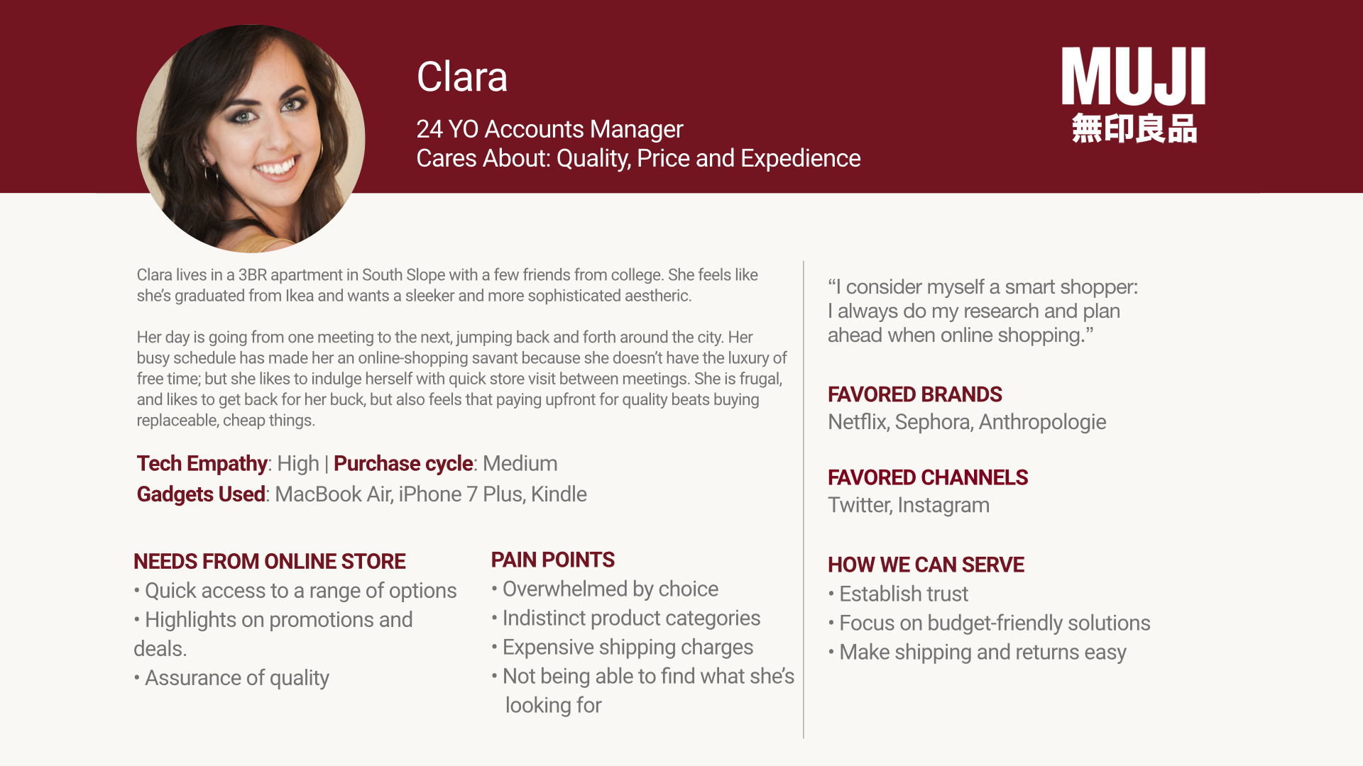
We’ve revised the provided personas, to represent the qualities of our target users: (a) someone who’s a store buyer but never online and (b) a potential online shopper. Our primary persona is Dante, a 52-year old Art Director, our loyal store patron. He thinks of himself as pen connoisseur; but at the same time, he is a sucker for novelty. The secondary persona would be Clara, a 24-year old Account Manager, our conscientious shopper. Her busy schedule has made her an online-shopping savant.

DESIGN
We want to be able to create a responsive web which would be more aligned to its aesthetic, its branding and its overall experience. We want to be able to bridge that gap between the physical store and the online experience. To address the problem, we’ve decided to tackle three main things (1) improving the experience, (2) improving navigation and (3) improving layout.
1. Improving the experience: How can we enrich the design?
To understand and frame their experiences better, let’s take a look at the process purchasing an item on the Muji site:

Purchasing an item: (1) Looking for a product, (2) adding the item to your cart, (3) complete checkout processes.
Based on our personas' needs, we can enrich the experience, by introducing features that would encourage playing around with the site: (1) quick view option, (2) additional product copy, (3) adding option to pick-up in-store, and (4) incorporating options to Move to Wishlist and Save for Later.

Areas highlighted in teal represent new actions that would encourage navigation for Dante, while areas highlighted in yellow provide a faster experience for Clara.
2. Improving the navigation: How can it make more sense?
During earlier usability testing, problem that people had was that they didn’t necessarily find products where they thought they might be. From our card sorting exercises, we were able to validate and contextualize the confusion.
To address this, we created a new information architecture, streamlining the ordering and making the categories more parallel.
A long with restructuring the top tier categories, we went in to reorganize the subcategories: below is how the mega drop down for each category is broken down:


3. IMPROVING THE LAYOUT: How can we make it visually appealing?
The main change was done consolidating the current landing page and the online store to a single landing page. This made the it more apparent that users were on shopping page.


- Moved the elements of the primary navigation to a GLOBAL FOOTER.
- Changed the side categories into a MEGA DROPDOWN, as a global navigation. Removed Products from main body.
- Changed the articles into a carousel.
- Added CTAs and copy to the features/articles. This would make them more akin to e-commerce stores.
- Shortened and trimmed product copy to make the section less text heavy and more straight forward.
Updated the layout of the product images
— Used a staged photo, so buyers have reference of what it’ll look like.
— Moved zoom function within the image (not over the description)
— Moved thumbnail images to the leftChanged Related Products to Shop the Look to include an assortment of items (hopefully to inspire users).
Included a Pick Up In-Store function. Created a button for checkout under [Add to Cart].
